HDRI or light looses material texture from certain angle.
-
@Dr-Sassi Oh, I have that book!
-
Thank you very much for your reply, thought-priest.
R.H. = Rotation Heading. Sorry, I thought you adjusted it, so I assumed that is known, but yes, I should write those things more clearly. Thanks for pointing this out.
One of the book's core principles is the attempt of the photographer to visualize not only the field of view but also how that field of view continues after being redirected by a reflective surface.
Since nature has no pixel resolution, we need to understand that in detail in a 3D setup.You might find that light on metallic surfaces has no effect, but the source has. In this way, you could just go with Emission-based materials. (Exception: Caustics might be a wanted effect or casting shadow to other objects)
Alternatively, use two or three Dome Lights and mix and direct the "light sources" in those and adjust each more to your liking, whereby I would use at least one without any HDRI as a global fill (or even test light in the beginning).
Placing these lights on a separate AOV (Arbitrary Output Variable) allows one to check each in the RS Render View separately. I think that is what you were doing already)
My typical idea of the light source (while others use it differently) is to go to block lights and use purely Intensity. When the mood/balance is in the way, I like to have selected all and work then with the so far untouched Stop slider to go up or down. This helps to get back to the initial or manage the scene more easily, like on set.Long lenses, like 600mm, are very close to an orthogonal view (I wouldn't use mine to shoot a macro, though), which I think was the target here.
Please add this camera to your scene as an exploration. It provides the parallel impression perfectly if that is wanted.
CV_2025_drs_24_CIot_01.c4dScale is always OK; perhaps setting the scene scale up as well helps (Attribute Manager> Mode> Scene).
You might often find the suggestion (at least I made it quite often in the past) that the best scale indicator is when the objects are insides/around three digits before and after (e.g., 123,006), which is, since years, not longer a needed, but a good guideline nonetheless.
Enjoy exploring your scene, as pulling off the right mood and expression is, at least for me, the most fun.
Cheers
-
Hi Dr. Sassi,
Thank you for all your help. I did the 1st steps of replacing with b&w HDRI just to see how the surfaces react.
I also rotated camera and played with lens focal length. I also added bot if Emission weight in material just to see the problem areas.The results as you see in screenshots. Is it normal to still see grayish color in some areas? Is it my materials? I guess I'm expecting the gold to appear "golden" everywhere. The loss of color information is what's I don't understand and not sure how to solve...
I will move on to add additional DOME lights as you mentioned.
Thank you!
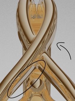
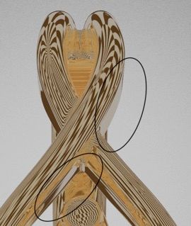
-
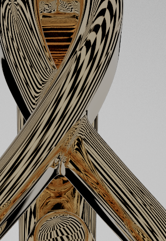
-
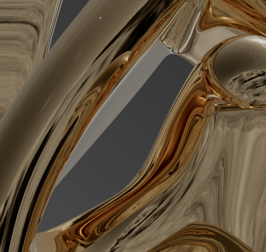
-
Hi thought-priest,
Switch the Backdrop off to see what information is behind the Gold Object. As we look at the sides of the object with a nearly tangential "view," the information is taken from the nearby background. You can't see it until you completely switch off the Backdrop.
That part of the image is around 1/20th of the viewing angle; roughly 2º is used for that part, while close to being tangential. So, the background does not have so much more. Quick guess: You do not even have 15 pixels for that side from 6K HDRI! While the image in a reflection should always be at least 1.5 times higher than the result (as the image pixel and rendered pixel rarely match (share a resulting pixel, which blurs the image), effectively, that side area has ten pixels (horizontally) in terms of average quality.
All the best
-
Hi!
I made the hdri image very large. so huge, it's unreasonably 1 GB!
I switched backdrop off. its properties always excluded the mesh.I start to think that it's purely my original HDRI and its grey colors. it just washes out in some area.
Thank you for all your help.

-
You're very welcome, thought-priest.
The "Backdrop off" idea was just for your exploration, to "see" what the rendering can "see".
Yes, those images can become large, and I have some HDRI (since I have loved to shoot my own for over two decades) that are much larger, 64K+ wide.
The small ones are more for lighting purposes only. Whereby only a very few in the Asset Browser are color precise, going by the light that would be expected, most of them are sadly color correct, easily swappable [sic], and lost, so they're used for my use).
My take on your question about washed out:
Washed out can have many reasons; often, little to no knowledge while developing those HDRIs leads to their limited usability, and I'm sorry that my input to the latest selection (in the Asset browser) was ignored. Hence the lower quality. I hope we can do better in the future.
Like a sunset is just more orange, one should expect a gray card to be gray then; things like that ruin it. In my opinion, one should always set up HDRIs. I use my Spectrum-meter (Sekonic C-800) and a light meter to shoot HDRIs. I do not trust 3rd parties, nor have I seen clear information about them. Libraries are for testing, to be frank. The worst case is Radiance (.hdr), which is a fake format 4*8bit integer, not 32bit/float/channel, and has pretty much the most questionable color management from all, meaning none in all cases I have seen.) so, if you can shoot your own.Cheers
-
P.S.: your output is 4800x6000 pixels, which requires a lot of resolution.
A 100% scale, but a crop with a 16,3984x8,192 image in the Dome-Light based on 8*8 large squares.
The sides are concave, which is a benefit, but look at the squares of 8*8 pixels.

I think the reflection works and shows details. Even I think that 16K is way too little for this camera setup.
I hope that clears the "dull" areas of the image. Please let me know if there is anything else; I'm happy to look into it.
Cheers
-
Thank you Dr!
I did the best for now about HDRI - further development of the image needed. The size definitely made a difference.
Now I have to work on crazy reflections/refractions I get, when combining two metals in one scene. Haha -
Hi though-priest,
Thank you for the feedback.
In the past, we mostly used a sphere and placed material on it. The idea is typically that the texture is on the outside of the sphere, correct, meaning the view on the inside needs it mirrored (U = -1). But that is here not important.
This setup here messes with scale, not with rotation. It is tailored to your project only.
CV4_2025_drs_24_REhd_01.c4d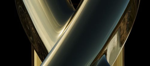
Dark areas from the image. I had all lights shut off for this image.
Please have a look below. Use the File Merge options to get the content into your scene, or open the file, select the "sphere," and paste it into it.
The HDRI used is from the Asset Browser, so it should load. However, please explore other HDRIs.My best wishes for your project.
-
Thank you! Looking at it now!
-
@Dr-Sassi
wow that's pretty cool! It works great, as the ring sits inside of the sphere.
I think its works even better than HDRI. And it feels that it gives more control than a Dome.
Now, I think of AOVs as compositing layers (which I will be doing alot of compositing later) . Given that the SPHERE is not a light, I can't assign it a AOV.
Is there such thing as rendering an object as an AOV?Thank you for all your help!
I'm so new at this. -
Hi thought-priest,
The Dome-Light is a convenient approach to the HDRI concept. It is "infinite" as each equirectangular (360ºx180º) image with a matching light dynamic of the surround is only true in the center of the Sphere (or Dome). The Sphere (or Dome) must be very large to avoid distortion when a (reflective) object moves. In your scene, we do not have animation. Hence, the Sphere can be smaller. The tiny size I chose here will not "reflect" (literally!) the reality of the surroundings with any camera settings, but you wanted to have details on every item.
The reflection of the object is the key for Multi-Pass Compositing (the technique that requires the AOVs); if the reflection of this source is the only information you need of a pass (AOV), then shut every light source off, even Global Illumination, and render the reflection from this Sphere. This needs to be used in Add blend mode in the Multi-Pass Compositing. At least in the past quarter century, that has worked for me in that way.
The Sphere with a material in the Emmision is the classic HDRI light for global illumination. It is effective and light for Global Illumination but not understood as such in AOVs. However, metal doesn't receive light (the dirt on it might) when you see the reflection of the light sources.
The key feature in the provided Sphere was mainly to get an option to bring it very close and scale it on the axis until it provided a better fit to the problem areas. This is for this case only and might need adjustments for others.
In the past, there was even a system with low-res HDRI material for the illumination and a second set up low-dynamic for the reflection but high-res. This never worked, as reflections, especially with Depth of Field and the resulting Bokeh, missed the typical "blooming." Hence, it is no longer in use, AFAIK. Besides many other problems, low-dynamic images have either tone mapping applied or clipped areas, which typically renders them useless from the start.
I share so much because I have the impression you like to provide high-end images, and that needs some exploration, typically case by case.
Enjoy
-
So there is no way to include an object like that Sphere as a separate pass in EXR? I would have to render completely separate, turning everything off, except for that Sphere layer?
Right now, I have all lights in their own AOV passes and export into single EXR.
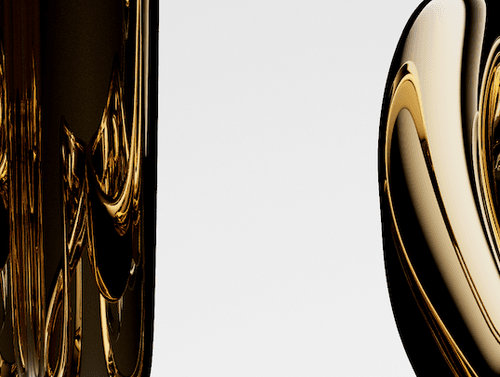
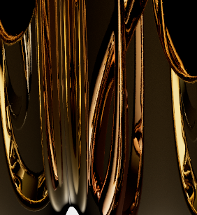
I'm a compositor myself, C4D is the new learning curve...I also have a question. I know I'm dealing with highly reflective materials, but if I have multiple gold object in the scene, they create very "unpleasant" reflections. They seem to look too much 3D. The reflections/refractions bounce off each-other and it looks too messy. Its just too much detail.
I don't know if I need to adjust Redshift settings (image attached), or materials (but then I'll loose my gold look)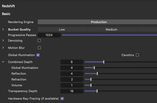
-
Hi thought-priest,
Try a smaple rate of 0.1 to compare if that is the problem. Yours was pretty small.
You write in a contradiction way if I get this right. Let's try to solve that.
Since I write in a forum, I surely will share what you might know for long, but I need this preamble to move on:
What looks right is not something that exists on an absolute level.
As artists, we observe and explore how visuals work on our audience. The main term here is conditioning. Not to start a long discussion; this is not the place for it, but what we consider reality is often a mix of impressions. As a trained artist, one has to recognize and lift these conditionings.
Since that is not fully possible, we rely on a mix of facts and individual impressions, both of what we think is real and of what our audience might buy as real.
For example, suppose a kid has only had artificially flavored strawberry ice cream so far while the artificial flavor is maximized. First contact with ice cream based on real strawberries might make the kid wonder what that is.So, what I think looks like Gold and what you have in mind might not match, but perhaps it does…
The question would be, what references do you have, and what is the difference between them?
Often, we have seen more images of something than the visual directly, e.g., explosions in space.
There is a difference between Hyper-real, Photoreal, and real. What is it that you are after?
I cringe when artists take reference images from the web. Why? Because it is not clear what process they used. Worse, Xero's request for noise is the result.Perhaps if it is photoreal, what does the glass in the lens create from the highlights, what artifacts are produced, and is that what we believe Gold looks like? Do you miss the Depth Og field in it, or the little imperfections that limit the reflections while keeping them sharp as an impression?
Similar to that is the idea of what is filmic. I have heard uncounted theories over the past decades.
In short, to get where you want to be is an arti direction call. Can you write it down without any constraints? In a log line.
Visual result in a render (while technical information, e.g., Puzzle Matte can be different)
The Sphere is set to be only visible in reflections, so no AOV shows the Sphere itself. If you could see it, you would see it from the outside—not useful, of course.
This means you have to set up a node system that shows only the front site. (Since I have flipped the Normals of the Sphere, inside is outside.) But even then, if it is visible during the rendering, a simple mask/alpha would allow you to separate it. If you don't want to see it, you can have it in one go.
https://help.maxon.net/r3d/cinema/en-us/Default.htm#html/Ray+Switch.html?TocPath=Shaders%257CUtility%2520Shaders%257C_____14The result of the object's reflection is an AOV.
Perhaps you need to set up the Gold differently
https://help.maxon.net/r3d/cinema/en-us/Default.htm#html/IOR_To_Metal_Tints.html?TocPath=Shaders%257CUtility%2520Shaders%257C_____7Consider post-production, and get some depth passes to vary the effect along Z. Render one with reflection Roughness and one without, then use the Depth Pass to blur the difference between the two.
Or explore the Post effect Bloom, it adds "light" to the scene and tames the contrast of the reflections in that way.
Have a great weekend