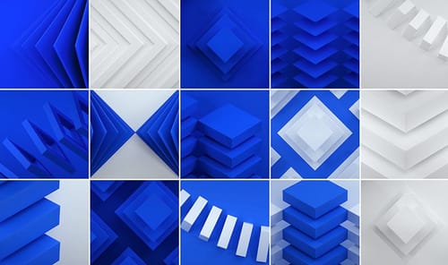
Achiving this style
-
I'm exploring this style in C4D + Redshift.
Can someone point me to a tutorial on how to start with the materials and the light setup?
Thanks!
-
Hi life-board,
Thanks for the file!
I can see an even and relatively diffuse light, but also some hint of shadow providing light.
The material is dull (not shiny or reflective). Since both images have different blue colors, I animated the color and changed the time to see different saturations.
The objects are low detailed and arranged.
The Camera feels more like 200mm in the first image and wider in the second.
Here is a little sketch
CV4_2025_drs_25_RSsk_01.c4dI'm not aware about a tutorial that delivers this look
Enjoy your weekend
-
@Dr-Sassi Thank you for your sketch!
My Dev is attached below. True that won't work yet with a white material because I tinted the lights to blue to increase the effect, but I'm happy to hear your thoughts in how to achieve a middle ground.
As always, many thanks for your support! Have a nice weekend.
-
Hi life-board,
I would not go with colored light for this. Keep it all white/grayscale.
My take here:
Set a Puzzle Matte for the Blue and the White. So you can color-correct them later (or tint them). Why the white one? If you render, perhaps the blue will "bleed" into the white. Perhaps that is wanted, as the white in the example is on the "cooler side". The contrast in the blue is lower, naturally, as the darker areas will create less contrast, so you can adjust both.
I tend to use color grade in posts and try not to get everything in the rendering, which would require having every shot in a perfect sequence: Continuity. Later in the edit, that might not work as our eyes adapt. Color Grading is faster.It is an art director's call, meaning yours.
All the best
-
Hi Sassi,
That's a good shout.Thank you for the hint.
-
Thank you very much, life-board,
When you get closer, let me know if something else is needed to come closer to your idea of this aesthetic.
As you know, any visual communication creates a different impression on anyone. Hence, feedback is always valuable for a stronger impression of a work.
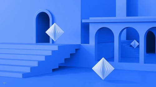
Example: When I see this dark blue, the work of Yves Klein comes to mind, and I instantly have a specific feeling. (IKB, International Klein Blue)
Enjoy.
-
Everything running well with the setup. That part of the project is now in a good place.
I'll send you here another note in case I need some more advise.Thank you!
-
Thank you very much, life-board.
Yes, questions about this thread are here; please put new themes in a new thread. Thank you!
My best wishes for your project